
A product page has a short window to earn a sale. The shopper decides within seconds whether the product is what they want, whether the store is trustworthy and how hard buying will be. Design shapes all three, and it does so before the shopper reads a single line of copy. A page that looks unclear, cluttered or unfinished loses people before the description has a chance to persuade them.
This guide covers the design decisions that matter most on a Shopify product page, and why each one affects sales. The examples assume a typical Shopify theme, but the principles hold for any store. You don’t need to be a designer to apply them. You need to look at the page the way a shopper does, on a phone, with a question in mind.
1. Make the product obvious
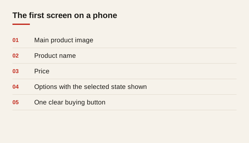
The main image, the product name and the price should be visible without scrolling on a phone. If the shopper has to search for what they’re looking at, many will leave. This is the first test to run on any product page: open it on a phone, look for two seconds, and ask whether you can say what the product is and how much it costs.
Use a large, clear main image, and let the shopper see alternative views easily. Show the product in use if you can, not only on a plain background. A photo of a jacket being worn on a trail answers questions that a flat photo cannot, such as how it fits and how it sits on the body.
2. Put the buying action where the eye goes
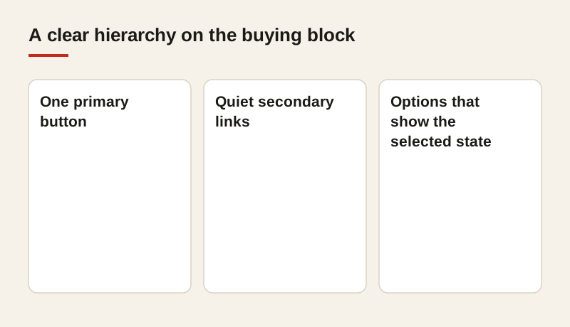
The add-to-cart button should be prominent, easy to tap and clearly labeled. Avoid multiple buttons competing for attention, such as a “buy now,” an “add to wishlist” and a “contact us” all in the same block. Each extra button makes the primary action slightly less likely to be tapped.
If the product has options, such as size or color, make them easy to choose, and show clearly which option is selected. A size chart should be one tap away, not hidden in a footer. A shopper who can’t tell whether the medium is in stock will usually leave rather than guess.
3. Answer the next question early
Most shoppers have one or two questions before they buy. Will it fit? Will it work with my setup? How long does delivery take? Will I be able to return it? Put the answers near the buying action, not at the bottom of a long page. A short line under the button that says “Ships in 2 days, free returns within 30 days” removes a barrier that would otherwise send someone to a competitor.
Think about the questions your support team hears most often. Those are the questions the page should answer before the shopper asks them. Every answer you move up the page is one fewer reason to leave.
4. Build trust without clutter
Reviews, delivery information and returns policy all build trust. Show them clearly, in a consistent place, and keep the design calm. Too many badges, banners and pop-ups can make a store look less credible, not more. A shopper who sees five badges and a countdown timer may reasonably wonder what the store is trying to sell them.
Reviews are usually the most persuasive trust signal. Place a short summary of the rating near the top of the page, with a link down to the full reviews. Keep the reviews readable, with the most useful ones shown first, and reply to the negative ones openly.
5. Use text that buyers can scan
Short paragraphs, clear headings and a bulleted list of key features help people read on a phone. Long blocks of text make the decision harder, not easier. Most shoppers scan a product page in under a minute, looking for the one or two facts that matter to them.
Put the facts in a list that is easy to find: materials, dimensions, weight, compatibility and care instructions. Put the story above it, in two or three sentences that explain what the product is for and who it suits. The list is for the decision; the story is for the desire.
6. Design for the phone first
Most product pages are viewed on phones, and the design should start there. Check that the image gallery, the options and the buying button all work with one thumb. Text should be large enough to read without zooming, and tap targets should be easy to hit without a second attempt.
Test the page in the portrait and landscape orientations on a real phone. Scroll through the whole product page and look for anything that overlaps, sticks in an odd place or hides the buying button. A problem that shows up on a phone is usually a problem for a large share of your visitors.
7. Keep the page fast
Design choices affect speed, and speed affects sales. Large unoptimized images, heavy sliders and too many apps can slow a page enough to lose shoppers before they see the product. A carousel that autoplays a dozen images may look impressive on a designer’s laptop, and feel slow and frustrating on a phone.
Compress images, limit apps and load the important content first. The main image and the buying button should appear before anything else, and the rest of the page can load behind them. If you can’t remove an app, ask whether it needs to run on the product page at all.
8. Keep the page consistent with the brand
A product page should look like the rest of the store: the same colors, type, spacing and tone. Inconsistency makes a store feel less established, and that affects trust. A product page that uses a different font, a different button style and a different tone of voice from the homepage can make a shopper wonder whether they’ve ended up somewhere else.
Set a short set of rules for the product template: the heading size, the button style, the spacing between sections, and the color used for prices and alerts. Once those rules are in place, every new product follows them without much thought.
9. Test before you decide
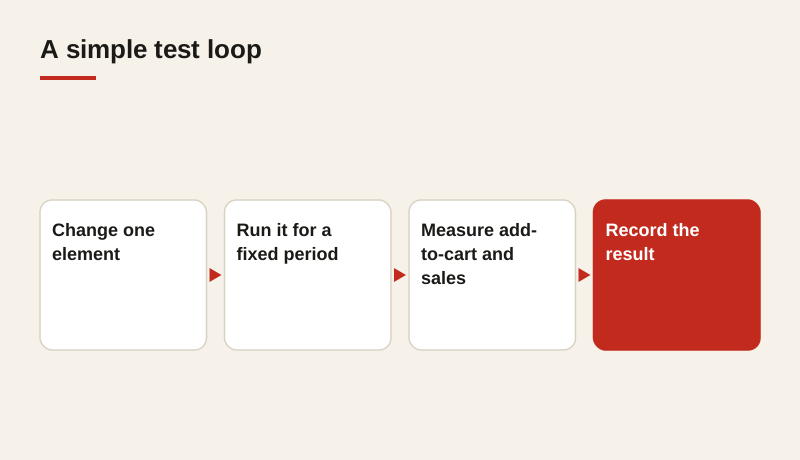
Design decisions are easier to judge with evidence than with opinion. Compare two versions of a product page, change one element at a time and measure the effect on adding to cart and on sales. The team may have strong views about the best layout, and those views are worth testing rather than settling by debate.
Keep a record of each test: what changed, how long it ran, how much traffic it had and what the result was. Over a year, that record becomes a practical guide to what your shoppers respond to, and it saves the team from repeating experiments that have already failed.
Common design mistakes
A few mistakes appear on many Shopify product pages. The first is burying the price below a long description, so the shopper has to scroll to learn what the product costs. The second is using a tiny add-to-cart button that is hard to tap on a phone. The third is showing too many apps, each with its own pop-up or banner, so the page feels crowded before the product appears. The fourth is using images that are too small or too dark to show the product clearly.
The last mistake is designing for the homepage’s taste rather than the product’s needs. A product page is a working page, and it should be judged by how well it helps a shopper decide, not by how striking it looks in a screenshot.
A practical checklist for each product template
Before a product template goes live, check each of these points on a phone and on a laptop:
- The product name, price and main image are visible in the first screen.
- There is one primary buying action, and it’s easy to tap.
- Options such as size and color are clear, and the selected option is obvious.
- The answers to delivery, fit and returns are near the buying button.
- The reviews summary is visible and links to the full list.
- The main facts are in a scannable list, with the story above it.
- The page loads quickly, with the largest images compressed.
- The design matches the rest of the store.
Where to start
Choose your three best-selling products, look at each on a phone and ask whether the main image, price, options and buying button are clear within the first screen. Fix those first, then measure the result over a month. Compare add-to-cart rates and sales before and after, and record what you changed. Those three pages will teach you more about your shoppers than a long list of design opinions.
If you’d like a second opinion, we review product page design as part of our Shopify work, and we can set up a simple test to show you which changes improve results for your store. We start with the pages that sell the most, because that’s where the gains are largest.
Frequently asked questions
What matters most on a Shopify product page?
The main image, product name, price and buying button should be visible in the first screen on a phone. If a shopper can’t tell what the product is and what it costs quickly, they’ll often leave before reading further.
How many images should a product have?
Enough to answer the shopper’s questions: the product from a few angles, close-ups of important details and at least one photo in use. Quality matters more than the count, and every image should load quickly.
Do apps slow down a product page?
They can. Each app adds scripts, and some load on every page whether they’re used or not. Remove the apps you don’t need and check the page speed on a phone after installing any new one.
How do I test a design change?
Change one element, run the test for a fixed period, and measure add-to-cart rate and sales against the previous version. Keep a record of each test so the team learns from every result.